Advanced plotting
Options
You can use many options with your functions to specify exactly how the functions should work. Here is a list of all options available.
| PlotJoined | Whether to draw lines between the sample points. |
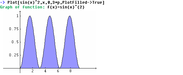
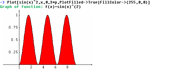
| PlotFilled | Whether to fill the area between the plot and the x-axis with a color. |
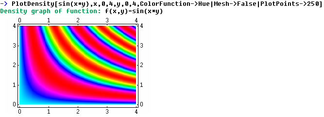
| PlotPoints | The number of points to make the plot from. |
| PlotColor | The color of the plot. |
| FillColor | The color to use when PlotFilled is active. |
| PlotRange | Specifies the visible area of the plot. |
| DottRadius | The radius of the points that will be placed at each sample point. |
| Axes | Whether to draw the axes |
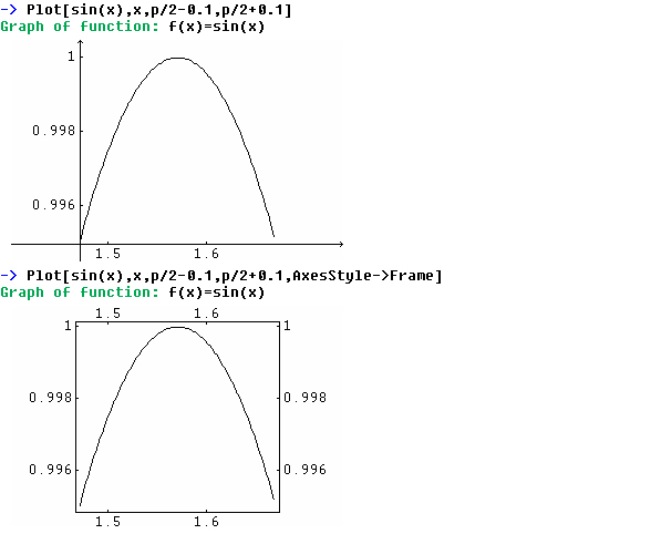
| AxesStyle | Whether to use axes of a frame. |
| AxesOrigin | Specifies the origin of the axes. |
| AxesColor | Specifies the color of the axes. |
| Ticks | Specifies the ticks of the axes. |
| Grid | Whether to draw a grid line at each tick. |
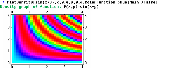
| Mesh | Whether to draw a mesh. |
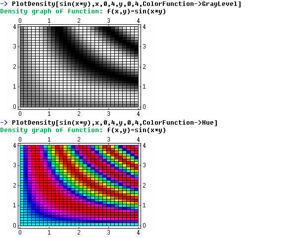
| ColorFunction | Whether to use hue or grayscale to visualize the z value. |
| BrushSize | The size in pixels of the brush to draw the plots with. |
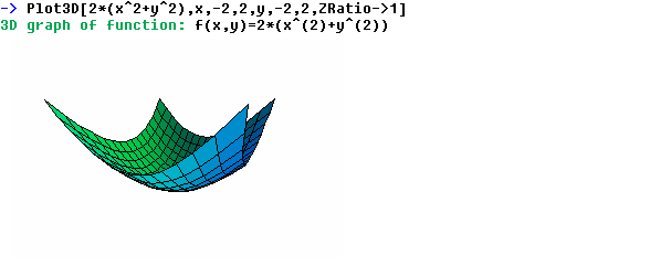
| ZRatio | The ratio between the x and y values and the z value. (Only used in 3D) |
2D Options
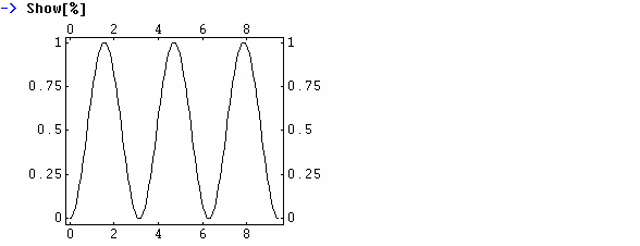
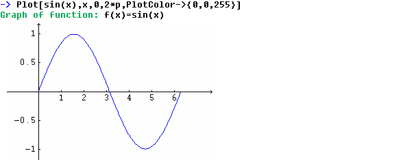
This changes the plot color to blue.
When you set an option you must use "->" This is because we want to separate
options from variables (to set a variable use "=")
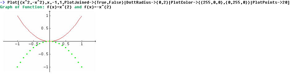
We set PlotColor to {0,0,255} this is the RGB value for blue. It works
like this, the first value is the amount of red, the second the amount
of green and the last the amount of blue. For each one of these colors
you can choose an integer from zero to 255. By combine this three colors
you can make any color, for example {0,0,0} is black, {255,255,255} is
white, {255,255,0} is yellow and {255,180,0} is orange.
This method to set colors are also used in the options FillColor and AxesColor.
If you want to use more than one options you separate them with "|" like
this.
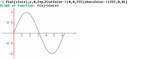
This is very important to remember because if you use "," it will not work and no warning message will be displayed either.
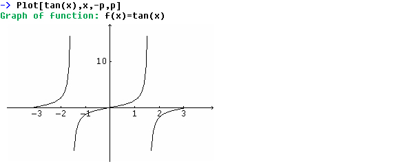
Whenever you plot a function, Eudox will try to scale the function right,
so you will get the best view of it. While this works very well in general,
it may sometimes give undesirable result, especially when ploting functions
with singularities. This plots tan(x) in the interval -Pi to Pi. Note
that tan(x) has singularities, in this case two singular points. The first
one at -Pi/2 and the second at Pi/2.
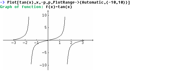
If Eudox does not scale the function right you can use the option PlotRange
to specify the visible area of the plot.
This plots the function sin(1/x)
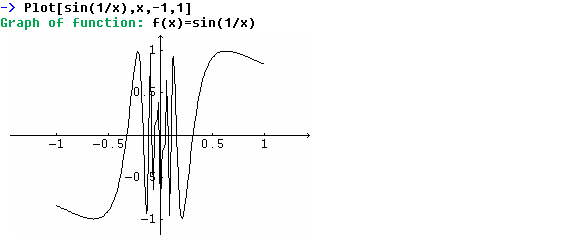
The plot looks a bit strange between -0.25 and 0.25. This is because
the default value for how many plot points to use is to low. This plots
the same plot but with PlotPoints set to 5000.
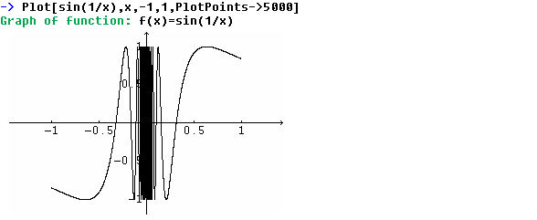
This plot is more correct but it takes more time to calculate.
When you plot several functions and want to use individual options on the functions, you do like this. This plots two functions with some different plot options.